
Create an Elegant WordPress Theme – Photoshop Graphic Design Tutorial 12
In Category:
Intermediate Photoshop Tutorials
I have had this web design Photoshop tutorial for an elegant WordPress theme in mind for quite sometime now, so I got things together and finally finished the article. You will be designing this WordPress theme from scratch with Photoshop. Every Photoshop icon, pattern, tool, and preset will be listed, and hopefully you can come out with the same results as long as you follow my walk-through. So let’s get started on this elegant WordPress theme using Photoshop.
……………………………………………………………………………………………………………………………………………..
Tools and resources that you will need:
– RSS Icon
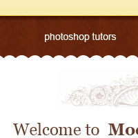
Have these tools ready and installed because you will be using them throughout the tutorial. Let’s begin by creating a new document the size of 1000×1300. We start our theme with the header, so grab your rectangular marquee tool, and using the image below as your guide, create it to that exact size. Set the background to white.

Once you have created the layer, apply the following gradient settings in Layer > Layer Style Settings.

Results so far

Now let’s add some text to our header. Using your newly-installed font, Helvetica Neue Bold, create a name for your theme and a slogan, if you wish. I called mine Moca le fresh blend. The text on the right is Georgia, which should be installed by default. There is a drop shadow added as well. Take a look at the guide below:

Results so far

It’s navigation time. Grab your rectangular marquee tool, and create a small rectangle right underneath the header. Fill it in with this HEX:7e2f10 color, and then grab your Burn Tool; set the size to 50, and stroke the top of the navigation one time. Exposure should be around 90%. Once you are done, select a pattern that you wish to use or just save mine listed below in the guide:
Pattern (Credit to Squid Fingers)

Results

Add some dummy text to fill up the navigation. I used an Arial font with the size of 14pt and aA set to Sharp.

Alright, now that we are finished with the portion of our layout, let’s work on some details. It’s always important to see if there is enough detail. Coming back to your original steps can be essential. Going back to the Brush Set that you installed, let’s use the first one. See the guide below to select the right brush, and then create one piece of the floral leaf, resized to fit our sidenote to the right handside of the header. Duplicate the floral leaf, and then go to Edit Transform – Flip Horizontal.

Results (Note: Setting the diameter size smaller will work, but it will ruin the quality of the brush, so therefore resizing would be ideally the best choice.)

Alright, now that we have added a little bit of detail to our header, let’s work on the navigation as well. Go to your Custom Shapes, and select the shape listed below in the guide. Using the shape-rounded tips, create a pattern of the tips and span it horizontally. You may also just duplicate the custom shape creating the same effect:


By adding that, not only did we improve our navigation but also gave an introduction to our welcome paragraph, which is what we are going to work on right now. Type up a brief introduction. Notice how I highlight the text that introduces the content, and then dim out the text talks about the content. This allows users to understand exactly what they will be reading. If you have a lot of information, it is important to highlight your topic sentence. I used Georgia for the introduction sentence Welcome to Moca… and Arial in the paragraph itself.

Okay, let’s go back to our Brushes. In your second Brush set, you will notice a lot of nice ornaments that can be used practically anywhere as paragraph intros/closures. In our design, it will indicate when the about moca will end. Using the specific brush listed below in the guide, create the ornament with the HEX: 6a3e2d, and then resize it to fit it in the center of the topic sentence. Drop the opacity to 26%, and then by duplicationg the layer and doing a vertical reflection, you will add the bottom of it as well (closure, that is).


Now we have to fully seal out the introduction area. Let’s do that by creating an average-size rectangle, fill it with HEX: dadada and then, using the Eraser Tool, fade it out so that you get a nice drop shadow effect.

Let’s go back to the step where we used the custom shape to create our separator for the content, the wavy line. Why don’t we duplicate that layer and reflect vertically. Place it on top of the drop shadow, and make sure the wavy line is overlaying the shadow. It should look something like this:

This part is where we actually will work on the WordPress part. I mean all other design elements are important in the final production. However, the WordPress plug will be located here. Begin by creating the “recent entries” title, which will introduce our wordpress content. Using your resources guide, open the RSS Icon file, and bring it over to your document. The font used is Georgia, set at a size of 24pt.

Drop Shadow Effect
Let’s create the base of our post. Simple things always bring out elegance, so grab your text tool and choose Georgia with a size of 24pt. Create two dotted lines and separate them enough to fill some content of the post. Add an avatar. I used mine from the Touch tutorial. The color used in the dotted line is HEX: e2e2e2. Just a quick hint: if you are planning to use avatars in your post, look up wp_avatar in the plugins section of the WordPress website.

Let’s add the title of our post, along with the content that will come with it. As discussed before, it is important to highlight the most important aspect of your press, which is your topic sentence or your tittle, in this case. Sometimes, making a larger font size can bring a great deal of a difference. Using a new color also will highlight your title. In this case, I used both methods. The font is Georgia with a size of 24pt and the HEX: cc2b23. I used a different font in the paragraph area: it is Arial with a size of 12pt.

There are various of ways to implement dates and comments into your WordPress. Some people add a Calendar, and place the date inside that calendar, or even use a bubble to display the amount of comments. In our case, we will go with the simple rectangular box. So create two rectangular boxes with a darkish background, and place the wordpress functions of date/comments inside.

And there you have it. Duplicate the post as many times as you wish, and throw in a footer. I used a very simplistic footer consisting of Credits to WordPress, and the usage of Creative Commons, which protects some of your rights to the design. You may use the RSS Icon to create the valid XHTML/CSS Format.
I hope that you enjoyed this tutorial, and grasped at least some of the concepts that you can use while creating a WordPress theme or any design, in general. For some really nice WordPress themes, also check out Theme Galaxy Premium Themes


This Photoshop Tutor tutorial has been tagged with: Photoshop design tutorials, web, web design, web designing, web layout, website, Wordpress, Wordpress template, Wordpress theme