
iTouch, create yours! – Photoshop Graphic Design Tutorial 9
In Category:
Intermediate Photoshop Tutorials
It’s been a couple of days since the last Photoshop tutorial, and I must say that I am very happy that we got another ten or so subscribers for Photoshop Tutor. Today, we will look into the newly-released iPod, the iTouch. Using our hands, and our very common tool, Photoshop, we will create our own!
…………………………………………………………………………………………………………………………………………………
So let’s begin by creating the surroundings of the iTouch. We will call it our base. Grab your Round Shape Rectangle, set the the radius to 20 and create the base. The color that I have used is #4a4f53.

Now, before we get to the depth of the base, let’s make the base for the screen. Using the same settings, create a similar shape inside the base.
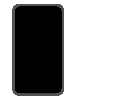
Our outline is now complete, so let’s add some depth to our base, the base being the round border around the screen. Using your dodge tool, stroke the left-hand side and the right-hand side at 50% Exposure. Then work on the bottom and the top. Now, select the Burn Tool, and create some shadows on the tips of the bottom corner and over at the sides. Touch it up, and you should achieve something like this:
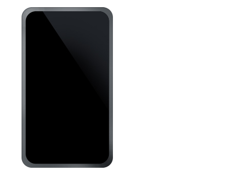
Let’s work on the screen now, as you can see that it has no detail. So we will add the famous glare that Apple uses on all their iPods. To do that, you will need to select the Pen Tool, and create an angular glare. Take a look at the way that I did mine so that you can get a clear understanding of what exactly I mean. The color that I am using for the glare is #1f2227, and you will notice that in my preview, I have used the eraser tool to sort of fade our glare from the left angle going down.
If you want, you can either crop the original home screen from the Apple home page of the iTouch in Gallery, or create your own, which could be any background basically. I used the the first idea, and in order to create a more organic look to the home screen, you will need to stroke with a 3px border, and set the color to #1d1e1f.
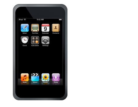
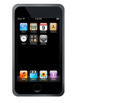
It’s looking much better now, and we are almost done. Let’s create the power/activate button of the iTouch. Grab either your Circular Marquee Tool or the Ellipse Tool, and create the base of the button. I also added a one-pixel stroke around the button, and set the color of the stroke to #2f2f2f.

You may have noticed that in the Gallery on Apple’s homepage of iTouch, the button has a depth indicator, which is the dim glare that they used. In order to do that, you will need to duplicate the button, clear all layer styles, and set the background to #FFFFFF. Then, slice 3/4 of the circle from top to bottom, and using your Eraser Tool, fade it out, and lower the opacity until you feel that the results are good.
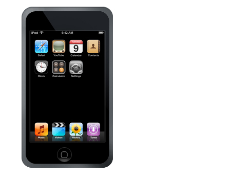
All we are missing is the squarish icon that iTouch uses, so why don’t we grab our Round Shape Rectangle, set the radius to 5 in size, and the stroke to #828282.
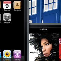
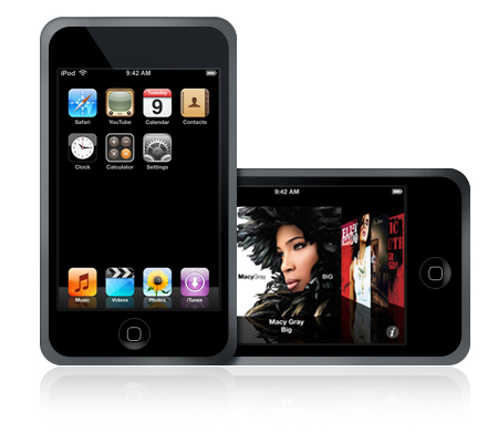
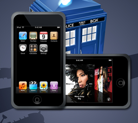
You are now done. I went ahead and played around a little, and created the following examples:
Thank you for reading, and I hope that you have enjoyed this tutorial.

