
Dashboard Clock – Photoshop Graphic Design Tutorial 3
In Category:
Intermediate Photoshop Tutorials
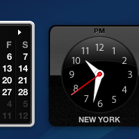
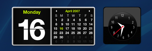
So today, I was just thinking of exactly what type of Photoshop tutorial I could write about, and maybe even give a few hints to people out there in the fields of designing with Photoshop. An idea of creating the Dashboard Clock from my MacBook seemed amusing to me, so I decided to go with it for this Photoshop tutorial. I was doing this the first time, so there might be some rough edges since I never edited it, but it should give you a basic understanding. By the way, those who were wondering about the wallpaper, the current one used is created by me, and the tutorial is coming shortly.
I just want to let you guys know that this tutorial is for more advanced users of Photoshop, so if you’re just starting out, you might not exactly get everyting, as it’s not so detailed. We will start by creating the base of the clock with the drop shadow, so you can play with the setting of the drop shadow. Mine was set to aproximately 50%.

Now, we will have to create the shiny look. Please add noise both to your glare and your base, as it will look more official compared to the Dashboard Clock.

Now, we have to create the clock itself, so take out your Eliptical Tool. Draw in a circle on top of your glare layer, and fill it in with black. Now add the border around the black circle, with the hex indicated below.

Now we have to create the glare, so if you want to get a more detailed view, you can just follow my way. Place the original clock design near yours, and draw a white circle inside the black circle about 1 or 2 pixels apart. After that, grab your eraser tool and set the opacity to 75%. Slowly brush from the top until you get something like mine. I also added a small tiny border around the glare just to make it look a little nicer.

Now we have to add all the digits inside. I personally liked how Arial Narrow looked on it, so I added that font, although I think that Mac’s designer used some other font that I am not familiar with or maybe just missed.
Create a white circle in the center of the digits. Following that, draw another red circle inside the white circle’s center, so you should end up having something like this:
Now by the alignment of the arrows on the clock, use your white circle as the base and grab your pen tool to draw out one of the arrows. Just by connecting to one side of the base of the circle and extending towards the numbered digit, and then following back to the opposite base of the circle, you can easily acheive those fancy arrows. Repeat the steps again to create the short arrow as well.
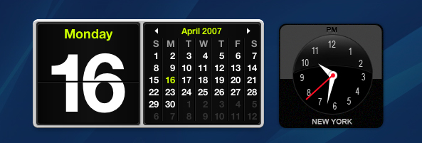
Now place the long arrow layer underneath the white and red circle layer. Follow by going to the Settings of the circle and adding a drop shadow of about 75% opacity, with the color filling of black. After you have done that, grab your line tool and set the weight to 2px. Draw a line from the red circle to the selected digit on the seconds.
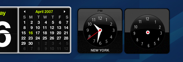
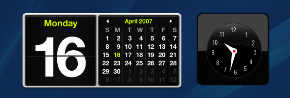
Now you’re basically done. Just grab your text tool, and add the State and the AM/PM indicator on top. If you’re curious about the colors, you can just take the hex of the original design. Your final result should look like this:
Compared to:
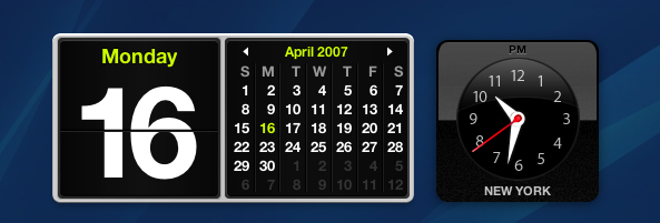
Not bad right?Almost identical! Thank you for reading my tutorial guys. Hope you enjoyed it.


This Photoshop Tutor tutorial has been tagged with: clock, clock drawing, clock icon, clock image, computer drawing, dashboard clock, draw a clock, drawing tutorial, Photoshop design tutorials, time